Who is supernova?
Supernova Consulting is a leading consulting, technology and outsourcing services firm serving clients in more than 30 countries. Combining unparalleled industry experience with leading technology offering, together with its clients, Supernova Consulting creates and delivers business and technology solutions that fit their needs and drive the results they want.
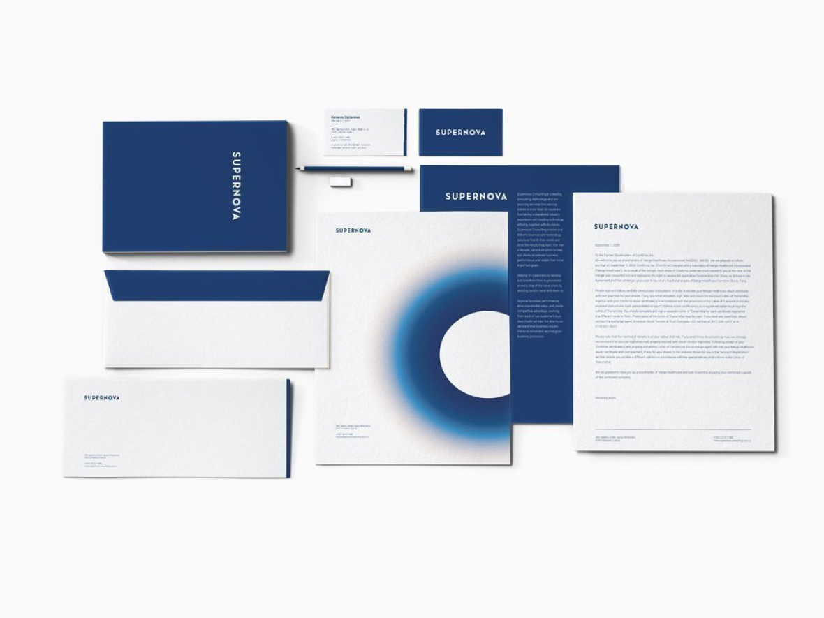
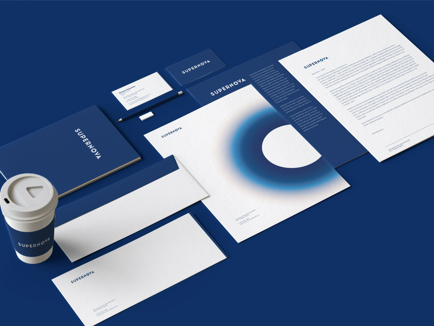
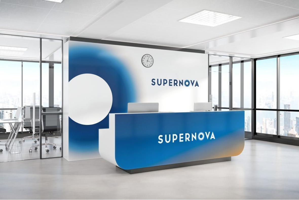
Corporate look
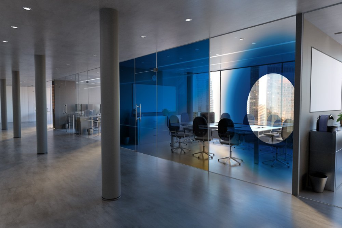
The brand’s look is inspired by the company’s name as well its vision and incorporates, throughout the visual appearance, the dominant blue that is universally associated with creativity, intelligence and technology.
The logo has been inspired by a black hole. A black hole is born when an object/star becomes unable to withstand the compression force of its own gravity. The star then explodes as a “Supernova”.
The Supernova brandmark uses a specially-drawn, proprietary typeface and portrays the bold and dramatic spirit of the black hole in a logo that stands in a progressive and confident manner.

Logo Constructon
Following the brand's philosophy and overall corporate look, the Supernova brandmark is represented by the Supernova Wordmark and the special designed “O” with a faded edge. We used the specially-drawn typeface, which must never be replaced by a generic or similar-looking font, to create an easily recognisable logo and enhance the brand's identity.
Our primary colour palette consists of blue and cyan as primary colours and the yellow as an accent colour, all three colours must be used consistently in dynamic and imaginative ways in order to help the brand stand out. The two primary colours (as mentioned above) when used on a white background will add to the visual impact of all communications.
Are you interested in our work and services? All you have to do is send a message!