The Client
SURF Productions is a Cyprus-based production company with an ambition that extends beyond delivering exceptional film productions. Its vision is to become a trusted partner for international producers, help position Cyprus as a global filming destination and contribute to a stronger creative ecosystem locally.
The name itself captures the philosophy behind the brand: navigating the highs and lows of production with confidence, while helping creative ideas move seamlessly from concept to screen.
The Challenge
SURF approached us with a blank slate and a clear objective: to create a visual identity that felt fresh, distinctive and instantly recognisable, while communicating trust, inspiration and confidence.
The identity needed to balance two sides of the brand: its creative, cinematic nature and the professionalism required of a strategic production partner. At the same time, it had to avoid the visual clichés commonly associated with the film industry, such as film strips, clapperboards, camera shutters or overly literal icons.
The Concept
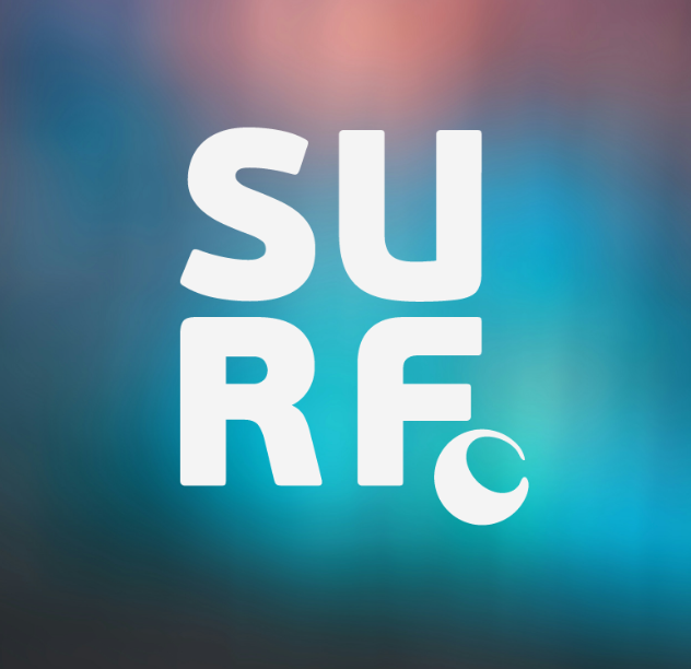
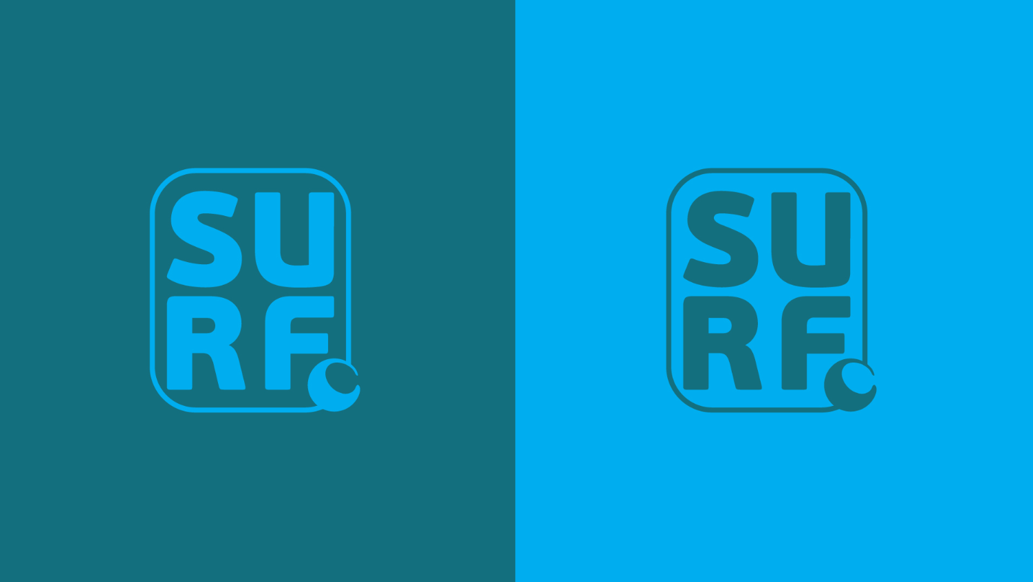
The final logo was built around a dual-purpose abstract symbol that represents both a breaking wave and the waning gibbous phase of the moon.
The wave connects directly to the SURF name and the idea of navigating the changing tides of every production. The moon adds another layer to the concept: as the force that influences the ocean’s tides, it represents SURF not simply riding waves, but helping to create them.
This acts as a visual expression of the brand’s wider ambition to act as a driver of creative, cultural and economic impact, generating ideas and stories capable of travelling far beyond Cyprus.
The Visual Identity
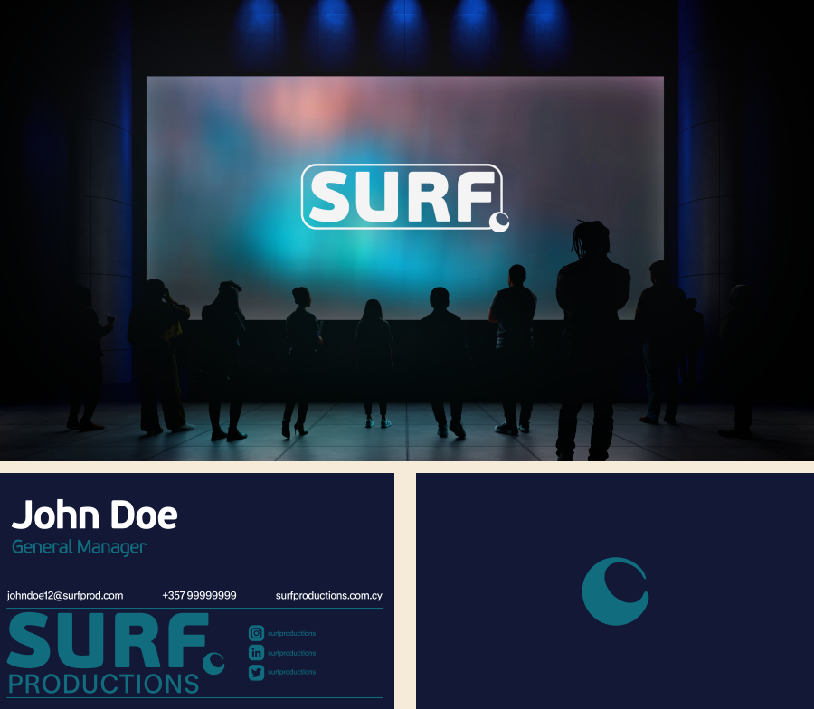
The wider identity was designed to feel bold, contemporary and cinematic without becoming overly complex. A flexible logo system was developed across main, alternative, horizontal and standalone mark variations, allowing the identity to adapt across different applications.
The colour palette expands beyond the brand’s strong deep navy base with complementary blue, teal, yellow, cream and warm peach tones, giving SURF a distinctive and versatile visual language across both corporate and creative touchpoints.
The result is an identity that reflects SURF’s positioning: confident enough for the boardroom, creative enough for the film set, and distinctive enough to make its own waves.
Are you interested in our work and services? All you have to do is send a message!