
The Client
Four Day Clearance is one of Cyprus' leading furniture retailers, offering a wide selection of furniture and home décor that combines quality, style and affordability. Over the years, the business has grown far beyond the traditional perception of a clearance store, becoming a trusted destination for customers looking to furnish their homes without compromising on design or value.
As the company continued to evolve, its visual identity needed to further reflect the quality of its offering or its long-term ambitions. The objective was not simply to modernise the logo, but to create a complete brand identity capable of supporting the business's new chapter.

The Strategy
The rebrand began with a strategic repositioning, introducing Four Day Clearance as the Smart Shopper: a brand that helps customers make confident decisions through products that combine quality, functionality and value.
This thinking shaped every aspect of the new identity. Built around four core principles (Value-driven, Practical, Trusted and Effortless) the brand was given a personality that feels knowledgeable, approachable and dependable, repositioning Four Day Clearance as a contemporary home brand customers can rely on at every stage of their home journey.

Logo Evolution
The new logo was designed to retain familiarity while giving the brand a more distinctive and ownable identity. At the heart of the wordmark is the elongated "O", a custom design element that improves recognition, strengthens memorability and becomes the defining feature of the new identity.
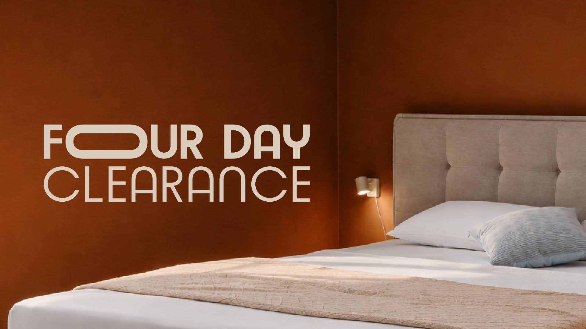
To increase flexibility across different touchpoints, we also developed a standalone "Four Day" brand symbol, allowing the identity to work seamlessly across social media, digital platforms, signage and future brand extensions. The result is a logo system that is cleaner, more contemporary and considerably more versatile in creating a fully redesigned visual ecosystem.
Building a Brand System
Rather than treating the elongated "O" as a standalone design feature, we transformed it into the foundation of a complete visual language. Using its distinctive shape, we designed a bespoke family of icons representing different furniture categories, creating a cohesive branding system.

Alongside the iconography, we developed a comprehensive visual identity that includes a refined colour palette, a modern typography system, flexible graphic elements, imagery direction and detailed brand guidelines. Every component was designed to work together as part of a scalable ecosystem, ensuring consistency across all communications, while giving Four Day Clearance a distinctive identity that is instantly modern and recognisable.
Are you interested in our work and services? All you have to do is send a message!